The Art of High-Performing Banner Design
There are two broad categories of banner ad designs:
1. Banners designed for “branding” purposes
2. Banners designed to generate leads and sales
Unless you sit in Coca Cola’s marketing department with an extra $100k spare to run a branding campaign, you better belong to the second category.
If you don’t care about your immediate return on investment (category 1), this guide is probably not for you.
How Not To Design Your Banners
Take a look at these 50 “incredibly creative” banner ads.
Most of these banners have been designed by branding agencies.
Branding agencies are not paid on performance, they are paid to come up with clever ads that are supposed to build a brand.
These banners might win advertising awards for being creative but they don’t win any performance award.
Here’s why you don’t want to design your banners like that:
- There’s no immediate offer, benefit or promise
- It takes longer than 2 seconds to even understand them
- There’s no strong call-to-action
For small businesses, there is simply no point in investing in clever branding campaigns.
Your ad dollars should be spend where they generate sales instead.
Branding is then a by-product of your sales and exposure.
What Makes A Banner Perform Well?
Let’s now look at the other end of the spectrum:
Banners designed to generate your desired response (clicks, leads and sales).
You want to invest $1000 and at least make $2000 or $3000 in return.
Three key rules for designing your banners:
- Write a strong headline based on a benefit, offer or promise
- Make your banner easy to read and understand
- Add a button with a strong call-to-action
Remember: Users might view your ad on a computer, tablet or mobile phone. It needs to easy to read on all devices.
Both your 90-year-old grandma and your 10-year-old son should be able to read it and get it in a matter of seconds.
What Banner Sizes Should You Use?
Then there’s the question of banner sizes.
We’ve previously written about the top 10 banner sizes.
The short version is, 80% of all banner ad inventory uses the following sizes:
– Medium Rectangle: 300×250
– Leaderboard: 728×90
– Wide Skyscraper: 160×600
For mobile display advertising there is one banner size that captures most of the inventory:
– Mobile Leaderboard: 300×50
In other words, by creating only four different banner sizes you can capture almost all of the available AdWords display inventory. You want to start with those sizes and then expand from there.
Static vs Animated Banner Designs
With regards to display advertising there’s one thing that marketers get more excited about than anything else: animated (flashy) banners.
I can count the number of times anymore that I’ve heard clients say things along the following lines: “We need an animated banner that shows these ten different messages.”
The end result is an animated banner with a ‘clever message’ that the average user doesn’t understand.
If you care about generating profits from your display advertising, clarity always beats a ‘clever message’.
You don’t get much of people’s attention span. Don’t try to make them think – just make your offer as compelling and obvious as possible.
My advice is to always start with static banners. By starting with a static banner, you are forced to focus on the message and impact of your banner.
Split test your banners on Google Adwords and keep refining your message further.
Once you have a well-performing banner ad, you can always add animated features to it.
Animated features can help increase your click through rate, but you don’t just want more clicks you want the right kind of clicks.
Design Lessons From Million Dollar Advertisers
One of the best ways to teach yourself the art of banner advertising is to analyse what million dollar advertisers are doing.
As stated earlier, you want to look at companies that focus on performance (rather than branding). The two are not mutually exclusive but you should look at branding as a by-product of a profitable display campaign.
Here are three examples of high-performing banner ads. We’ll discuss each one in detail below.
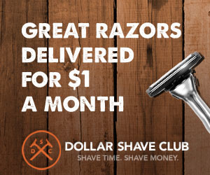
Example 1: Dollar Shave Club

Dollar Shave Club is a great example of how to run performance-focussed advertising while maintaining a solid brand image.
The banner example above is super clear, easy-to-understand and advertises an almost irresistible offer. “$1 razors”, that was unheard of before they came around!
Check here for more Dollar Shave Club banner examples.
Example 2: Groupon

A few years ago, there was no way you could browse the web without seeing one of the Groupon banner ads.
Groupon’s banner typically feature images of mouth-watering food with a price focussed benefit (“up to 70% off”).
Click here for more Groupon banner examples.
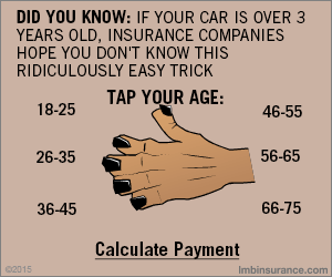
Example 3: Lower My Bills

LowerMyBills is arguably one of the most aggressive display advertisers online.
LowerMyBills is taking direct-response advertising to the extreme. The purpose of this example is not to suggest you should advertise like this but rather to illustrate why their ads are so effective.
The basic promise of the offer is that LowerMyBills is able to offer lower rates on insurance, mortgages and loans.
It’s important to understand that this offer appeals to a very broad audience. Therefore, LowerMyBills banner ads are highly focussed on being as attention grabbing as possible.
LowerMyBills banners always stand out by looking weird. They basically do the opposite of what most other advertisers do. Additionally, their banners are typically animated in order to maximise click through rates.
Click here for more LowerMyBills banner examples.
Further Reading
Banner Ad Blueprint: 5 Components of an Effective Banner Ad
Banner Ads Suck (and How to Make Them Convert Better)
14 Design Tips For More Clickable Banner Ads

No comments yet.